
Fanatic - Restaurant
Fanatic is a Bristol based agency that work with mulitple clients and the project I was given was to create a restaurant that served any food of my choice and the entire restaurant has to also be linked to a usp of my choice.
With the added extra of us creating promotional material and menus and a logo and choice of name for our company. I were also tasked to create brnd guidelines for my restaurant.


Menu, Posters and Pattern Designs


Presentation
This is a slideshow / video of the work I did and what I presented to Fanatic to show them my route and idea that I had createed.
Design Report
We were given the brief on creating a restaurant and it must have a USP’S that links to the theme and the logo that you create, and the name must fit into those specifications as well. We were given the task of also creating the brand guidelines as well as doing research on other companies for gathering information and showing ourselves how we should lay out and create our work. We were given the specifications of creating lots of different work for our restaurant such as posters and adverts.
To start I researched different business USP’S, logos and foods and then annotated different images so i could get an idea of how they all link and what I could use in my business idea and i even had a look at different websites for inspiration on art styles and how they tie into the business design. After I had done most of my research i went out exploring Bristol and taking images of multiple different business, I took photos of their logos, menus, inside and outside of the restaurants to get a more in person idea of how I wanted my ideas to come to life and find the best experience that I could think of and provide to the customers and how I could best hit the brief.
To start with my routes, I investigated different experiences that had not been explored yet and used ai to help further explore my routes and gain a stronger footing with them (a campfire restaurant, a smart table restaurant and a restaurant based on 4 rooms with different colours in each room). For each route that I was exploring I made multiple different mood boards (colour palettes, food and objects that would be used in the restaurant design, other logos that I could use for inspiration in my designs and one for typography that could be used in my logo for the front of the restaurant). Using all this I made multiple drawings for each of my 3 routes and based on these drawings I made multiple different illustrations for each and even used AI generated images for each so that I could have an idea or put my ideas into perspective so that people could see my idea more clearly. For each illustration I chose for my routes I experimented with colour and did multiple variations of each.
Ash and Ember (Campfire Restaurant):
For this route I based it on a campfire design where the restaurant served barbecue food to customers and there was a larger fire in the center of the restaurant that the chefs cook food over for customers to view the food being cooked for them in front of their eyes and they can also cook their own marshmallows over smaller and safer open flames to get a camping experience. After everything that I created I decided to change my logo design to a tent so that customers could get the message of the experience more clearly and then created a colour palette and fonts collection and a mockup of my logo to see how it would look.
Byte & Bite (Smart Table):
For this route I based it on an interactive touch screen table that you order by dragging and dropping you items that you want onto your pizza as this is a pizza restaurant and then when your waiting for your food you can watch videos play games or watch a live feed of your food being made. For my logo for this restaurant, I made it a blue colour because it is the colour I think of when I think of technology and there is a robot and bite taken out of one of the letters in my logo design. I also created a colour palette and font page with a mockup of my created logo on it on the front of a building so I could get a view of the real-life thing and see if it were acceptable.
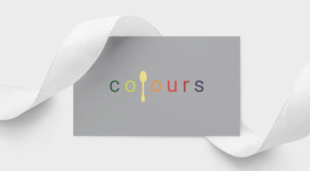
Colours (Coloured Room Restaurant):
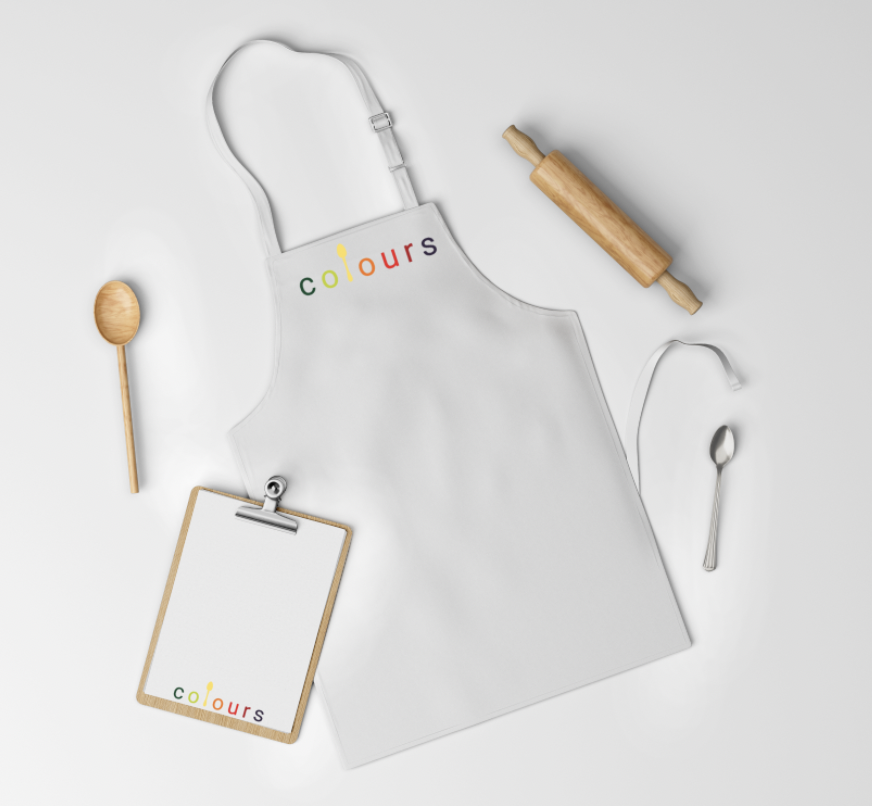
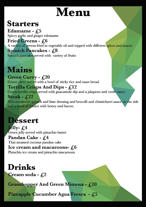
For this route I based it on a business idea that the restaurant has 4 rooms and each room is a different colour and in each room they serve food of that colour in each room and the same goes for the drinks in each room for example in the green room you will be served green food such as either an all green salad of food that is dyed green but can have other food colours in the meal but the meal has to room colour focused. For my logo design I used a spoon in the place of the L in colours and I experimented a lot with colours and different utensils in the place of the L and I also used glow with different colours on each and tried designs with backdrops. I decided to go with a white design and each of the letters had a different colour glow and the colours of the glow were from the main food groups and I created a colour palette and a typography collection and mockup of the logo name on the front of a business.
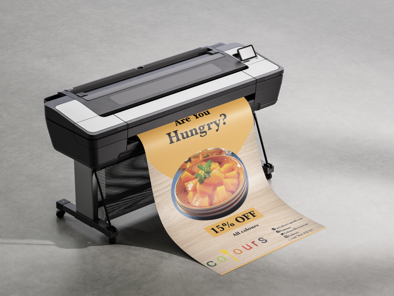
I chose colours as my route after a guy from Fanatic came to look though my work and he told me to go down whatever route I prefer so I chose colours as thought I could have a wider range of options for how I wanted the actual design to come out, so then I changed my design to remove the glow and make the colours of the letter to the colour of the glow. For this route I created 5 different menus, 1 for each room and 1 for a drink's menu and each of them had a different pattern and a different colour and it took me very long to create and make the food for the menus and the pricing.
I spent a long time researching and looking at other companies' brand guidelines so that I could create the best brand guidelines for my own business. The brand guidelines I created included the does and don'ts of my logo, they had colour palettes, typography, and tone of voice, had my mission statements strapline and experience. I then created my presentation for when I showed fanatic my work and this included my menus, logo, brand guidelines and my patterns and advertising but with all of this I also had mockups using my logo and patterns and social media for the business just so I could explain what I did and how I got there and also show them my idea. I then also had to draft a week-by-week report and a critical evaluation about my work.
I think that the work I produced was good and I liked it my brand guidelines as I spent a lot of time trying to find the right fit and design for my company that would allow for changes but nothing that changed the entire restaurant. I thought I made really good mock-ups of my product and I thought my pattern was really unique and was a great way to depict the colours in my logo and also great for branding in the form of business cards and take away bags, however I think my logo could use some work and the same goes for my menus I went into a lot more detail about it in my critical evaluation.